Shining Light on the Digital Divide
Article
•
August 1, 2022
Shining Light on the Digital Divide
Fabion Kauker, Rich Gibson, Xun Li (from Unfolded team at Foursquare)
August, 2022
How to Build an Open Digital Divide Index
There are many ways to think about the digital divide, and it has been argued that one of the biggest barriers to doing so is the existence of accurate data [ref]. But it might not be known that there are two sides to this data. What an ISP would have you believe they can offer in a given region and then what the experience speeds are by customers. The FCC first published data in 2000 [ref]. In which it is stated that:
“We concluded our first report on the deployment of advanced telecommunications capability in February 1999, at which time we committed to monitoring advanced telecommunications deployment through annual reports.5” [ref]
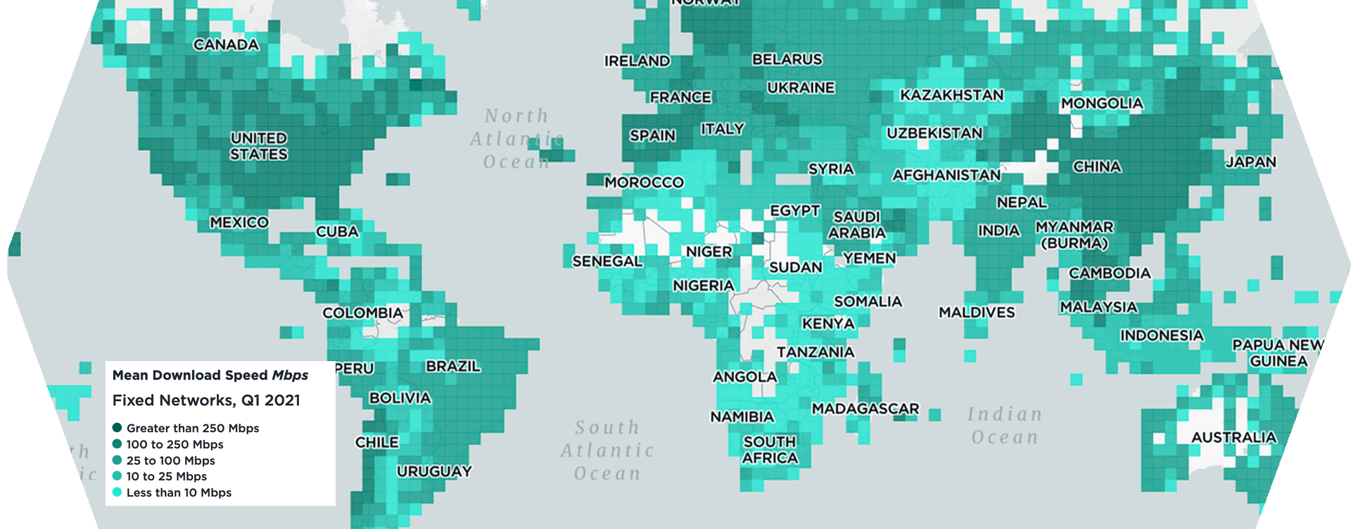
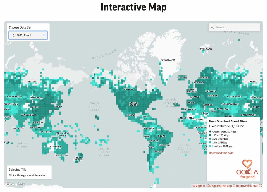
It sure has evolved from here and now data is available in Geospatial format on a bi-yearly schedule [ref]. The other side of this data has been gathered by SamKnows [ref] and continues to evolve. New entrants like Ookla and MLabs have also made data available. Specifically, Ookla has released global geospatial speed test results to a rather accurate resolution [ref].
Creating a national Digital Divide Index
We want to deliver more choice and competition to the places that need it the most. To do this we can use data to explore and start a discussion for what should contribute to measuring the digital divide in an open manner. There are a few existing approaches but we believe that they fall somewhat short. Either in being open, reproducible, anchored (comparable over time) or extensible. Tufts presents an excellent view of “people over miles” as an approach. [ref] Then the realization that it’s not just about speed but the social implications of less access to an essential service, internet/broadband. Too often it comes down to a discussion on “how will we pay for this?”. Purdue has also done some great work at a state level [ref] making it easy to get key data and communication/content by creating a “Digital Divide Index”. Now just to round it out broadband.money also has its view of “Ready Speed Rank” [ref]. There are even tech companies like Microsoft putting their expertise into play building a “digital inequity dashboard” [ref]. None of these are reproducible with code working shown. We seek to address this and begin a discussion on how we all might collaborate. Lastly none of the current models take into account the community in a sense of what is there (the geo component). We offer a prototype taking into account the distance to libraries. But schools or other anchor institutions could be added also. Lastly one of the goals of a score should be that it can be captured over time and compared. We showed previously that the Ookla speed test delta could go up and down! Also as data changes there needs to be a way to unify the disparate data types. This shared effort could be something sponsored in a GitHub Open Source project via FCC, NTIA, Microsoft and other stakeholders network owners like AT&T, Verizon et al. Or perhaps Google/Carto could host the data for public free querying in BigQuery. Ideally it becomes like the OSM data pipeline for BigQuery. Back to the data… By using the following data points (much like the other examples) we can combine them into a score scaling each factor to between 0-1. Further in the future these could even be applied based on rooftop area and other apportionment methods. This is done for data sets in the Unfolded Data Catalog! Census ACS via SafeGraph & Unfolded.ai
- # Households
- SNAP utilization
- Public assistance
- No computer
- % Household with internet
- % Income <= $50K
FCC 477 via
- Number of providers
- Max download
- Max upload
Ookla
- Mean download
- Mean uploads
- Number of tests
OpenStreetMap POI via SLIPO
- Library locations
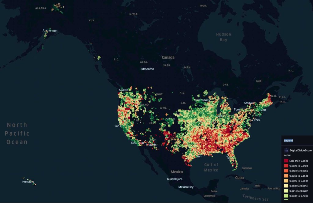 Map of the “score”, low = most affected
Technical implementation
We will use Google Colab and the data is in a GDrive folder to make it easily reutilizable. You’ll need a GCP account to create the data in Google Cloud Storage and BigQuery. You can review and run it HERE.
Writing Effective BigQuery
One of the biggest challenges with this kind of large data (note NOT big data) is getting it all in a single location, loading and formatting it. Then being able to join it. I’ve mentioned before that we should use more advanced methods but for now let’s just keep it simple (link, link, link, link).
Using Hexagons/S2 grid or similar
We previously discussed why this is a good idea but to give some background this is important and useful because we want to have similar area grids that cover land mass. Here is a great talk from Nick Rabinowitz. Even more so we can start to frame the usage of a budget to address change in the potential revenue, competition and cost for each hexagon. This can be framed as an optimization problem where we can determine how best to spend the funds to get the most improvement or best efficiency.
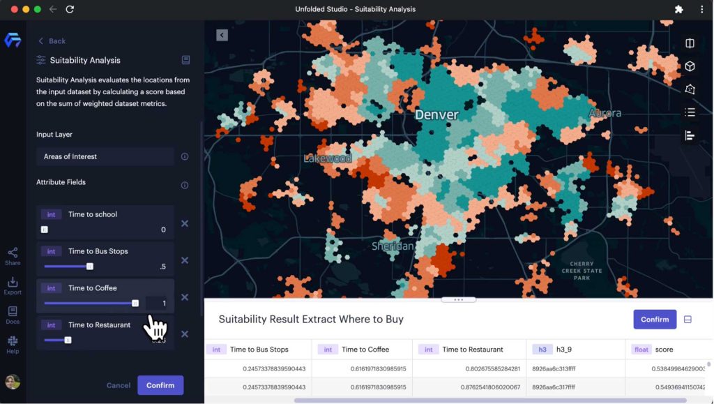
Unfolded Hextiles and Suitability Analysis
Now why are we preparing this data? Well we want to explore which factors have a large impact and how they balance with one another. This can be done interactively in the new Suitability Analysis tool capability in Studio. So the main thing is to allow anyone to explore alternative definitions which show the impact on their community. You can run your own analysis HERE. You can even join to any data set in the catalog and rerun.
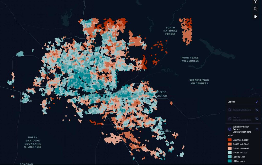 Phoenix Arizona Digital Divide, low = most affected
How Does Suitability Analysis Work?
The new module provides a simple UI based workflow that makes it easy for users to evaluate site locations for a particular use by computing a suitability score based on a set of weighted factors. Suitability analysis has been widely used in GIS for site selection [ref], and can be easily extended to other applications for finding suitable regions, places or sites [ref]. The national digital divide index map is a great example of suitability analysis applications. When performing suitability analysis, users need to define the problem and the candidate locations/regions on the map first. The next step is to collect the data and assign a relative importance weight to each factor from which the method can compute a suitability score (The suitability score is computed as the sum of the weighted factor values.) or index value, e.g. the national digital divide index. The result is a suitability map that ranks all locations/regions into different categories: results with a lower score are in less suitable/more affected categories and those with a higher score are in more suitable categories/less affected. Dependent on how the metrics have been defined. Suitability analysis depends heavily on domain knowledge, and because the results are sensitive to the configuration of the factors and the weight values, multiple iterations are often needed to get a suitable outcome. In Unfolded Studio, the suitability analysis is built with an iterative workflow in mind and is designed as an exploratory tool with an interactive UI that allows users to adjust factors and weight values with a map to preview the results on the fly [ref].
Exploring a Analysis
 Animation link: https://player.vimeo.com/video/729709540
Next steps and contact
As you may have noticed there are data gaps and assumptions all over this implementation. This has been shared in the interest of expediency such that everyone may start to think about the implementation of shared methods. Especially as the BEAD funding starts to be allocated to States. If you are interested in anyway or have comments/corrections please reach out us at fiber-planner@open5g.com -

A leading expert in data modelling, GIS mapping and network design, Fabion Kaukor brings extensive experience in developing solutions for global networks and multinational technology companies across cloud, fixed/wireless connectivity, computer software and business operations domains. Formerly VP of American Ops at Biarri Networks, Fabion is dedicated to solving last mile problems across many verticals.
Was originally published on LinkedIn.
About Hexvarium
Hexvarium is a broadband service provider using proprietary Data Science to accurately identify, deliver, and connect profitable networks across all geographies. Building sustainable broadband networks is a complex puzzle of continually changing factors. Yet all other designers, engineers and operators deploy capital using static, antiquated methods and knowledge of each community. Hexvarium’s approach delivers sustainable networks, even in the most challenging circumstances. For more information, please visit hexvarium.com.
Media Contact:
Jennifer Spoerri
Gallagher PR